Landing pages are the workhorses of digital marketing. They’re where ad clicks, email links, and social posts lead people, and where those people either take action or disappear. But not all landing pages are created equal. In fact, a cluttered, confusing, or generic page can tank your conversion rate no matter how good your offer is.
So what makes a landing page actually work? Here’s what every high-converting landing page needs, and what you can leave out.
What You Need
- A Single, Focused Goal
Unlike your homepage, a landing page has one job: drive a specific action. That might be signing up, booking a call, downloading a guide, or making a purchase. Everything else should point to that goal.
Pro Tip: If your page has more than one primary action, it’s not a landing page, it’s a website.
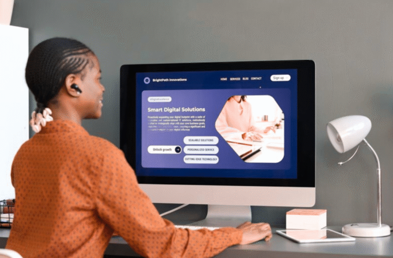
- A Compelling Headline + Subhead
The headline is your hook. Make it bold, benefit-driven, and immediately clear. The subhead should reinforce the value or speak to a common pain point.
Example:
“Get More Leads Without a Bigger Ad Budget.”
Learn how to streamline your website to convert more visitors into clients, starting today.
- Simple, Skimmable Copy
People don’t read, they scan. Use short paragraphs, bullet points, and bold text to highlight key takeaways. Focus on benefits, not just features.
Pro Tip: Write for a specific reader. What are they struggling with, and how does this solve it?
- A Strong Call to Action (CTA)
Your CTA should be clear, visible, and repeated throughout the page. Use action verbs:
- “Download the Free Guide”
- “Book Your Free Call”
- “Get Instant Access”
Pro Tip: Add urgency or a low barrier, like “no credit card required.”
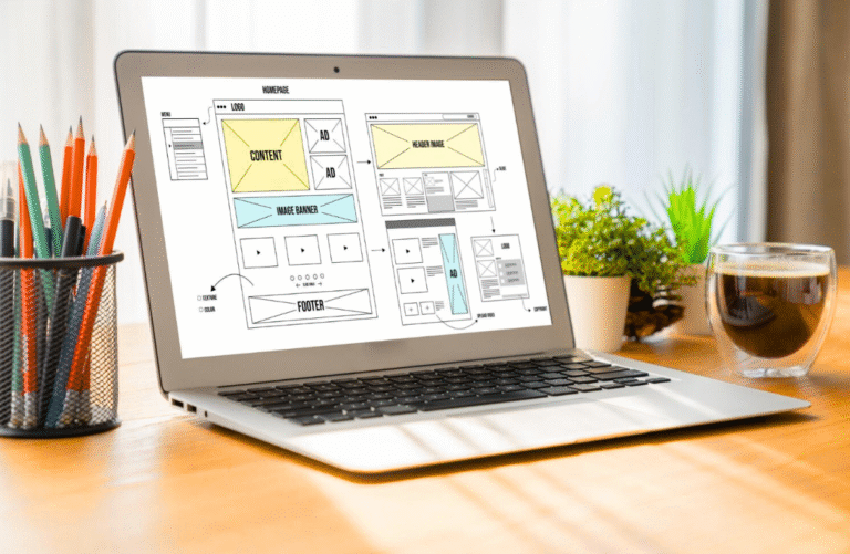
- Visuals That Support the Message
Photos, mockups, or explainer graphics help break up text and show off your offer. Just make sure every image serves a purpose.
Avoid: Stock photos that feel impersonal or irrelevant.
What to Skip
- Your Full Navigation Menu
Landing pages are designed to keep people focused, not send them wandering around your site. Removing your main nav is one of the easiest ways to improve conversions.
- Walls of Text
No one is reading 8 paragraphs about your backstory. Keep it tight. Save the details for your About page or follow-up emails.
- Multiple Competing CTAs
Don’t ask someone to book a call, follow you on social, and sign up for your newsletter all on the same page. Pick one action. Make it count.
- Generic Language
“Solutions for every need” doesn’t mean anything. Be specific. Be human. Speak directly to the person you want to reach.
The best landing pages don’t just look nice, they convert. By stripping away distractions and focusing on clarity, relevance, and strong messaging, you can turn more clicks into clients. Every word, button, and image should be working toward the same goal: action.